Monday, November 18, 2013
Thursday, October 17, 2013
Tuesday, October 8, 2013
Saturday, June 26, 2010
Monday, September 14, 2009
TEDx Presentation Event in Beijing, November 2009
 TEDx is coming to China for the first time! Click here to register to attend TEDx or here to suggest a speaker who has 'an idea worth spreading'. This event will showcase some of the leading thinkers and innovators living in China. TEDx is a self-organized event following the same TED guidelines as the world's premiere presentation conference.
 You may also follow leading presentations on the TED Blog.
Top Ten List for Pecha Kucha Success

1. Direct the story toward the audience not yourself
2. Interact - ask a question, give a prize, show a demo
3. Lose the laser pointer. Lasers belong in Star Wars films
4. Never read notes - shows lack of preparation/respect
5. Don't deliver the presentation in two languages - there is no time
6. Speak loud enough into the microphone
7. Clip Art is dead. It is childish. Leave it in the 1990s.
8. Avoid stock photography - it is artificial. Develop your own slide.
9. One presenter is better than two. Unless an actual performance.
10. Your presentation should help 'solve an existing problem'
On Sept. 12, eleven speakers were given 6.40 seconds to share ideas about architecture, environmental activism and local music. A successful speaker needs to deliver each key point on the slide as briefly as possible. No extra explanations can be added - there isn't enough time. Beginning a sentence with the wrong point, is like a sprinter taking off from the starting line on the wrong foot - the momentum will be lost and the sprinter will finish last. Pecha Kucha is a mental endurance test. As a sprinter requires active practice and training, a Pecha Kucha speaker should dedicate hours to rehearsing their presentation. The audience deserves nothing less.
Sunday, March 29, 2009
Speak to Both Sides of the Brain

Redux Picture Blog, Visual Storytellers

 A presenter must understand how to visually tell stories. Photos are commonly used on presentation slides, so it is important to study the masters of photography. An excellent resource is the Redux Pictures Blog. This blog includes pictures from many of the world's best photographers.
 Wednesday, March 25, 2009
A Remote Improves Presentations
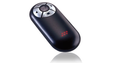
The compact Communicator presentation remote fits in your hand like a smooth pebble. and includes Forward, Backward, Black Screen and Escape functions. That is all the remote functionality you need for a presentation. If you want a complex remote, than buy a Wii videogame console. And if you insist on using a laser pointer, I suggest buying a light saber and trying out for Star Wars The minimalist 'VersaPoint Communicator' by Interlink Electronics is one of the least expensive remotes on Interlink's website, costing $59 USD. The Communicator allows you to walk up to 30 feet (9 meters) away from your computer.
A presentation remote gives you the freedom to leave your laptop, reduce distraction and keep the audience focus on your message.
Other excellent presentation remotes?
Monday, March 23, 2009
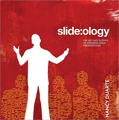
A Powerful Presentation Book
Wednesday, February 25, 2009
Pecha Kucha 20 slides x 20 seconds ea. = 6.40 sec Presentation
 Pecha Kucha is a system of delivering a six minute and forty second presentation in 20 slides @ 20 seconds per slide. Two expatriate architects based in Japan named Astrid Klein and Mark Dytham developed the Pecha Kucha method in 2003 as a means to get to the core of the message from design presenters.
Today Pecha Kucha events welcome creative speakers from all backgrounds and has spread across the world from Tokyo to San Francisco. In Dec. 2008 Pecha Kucha was hosted at the trendy Song Bar in Beijing, which attracted hundreds of spectators including members from my presentation course at Peking University MBA school. A pupil of mine named Stone Shao saved the day by providing a ThinkPad electrical supply cord to power the event's PC! This weekend in Beijing, Pecha Kucha ペチャクチャ, which means 'chit-chat' in Japanese, will showcase the essence of what presentation innovation is all about - creating new methods to clearly communicate.
Tuesday, February 24, 2009
Compress a Large PowerPoint File
- Save a newly named copy of your PPT file
- Open the PPT file and right click on any photo image.
- Click Format Picture
- There will be a menu with five tabs. The tab Picture should be open, on the lower left hand corner click Compress
- 'Apply to' All pictures in document
- 'Change Resolution' Web/Screen. Click OK and you're done.
This will change every image in the PPT deck to 96 dpi from 200 dpi, effectively reducing your file size by 50%.
To further reduce your file size, open a New Folder on your Desktop. Next right click and save each photo image as a .JPEG file, into the New Folder. JPEG image sizes take up the least amount of space compared to .bmp, .png or the enormous file size .tif.
Then delete all the original photos in your slide deck. Next click insert photo, and Select All images in the folder. This will batch insert all the photos onto a slide in your deck. Then manually cut and paste each image into its original place in the deck. Finish and Save your file. Click on properties and see how much space you saved. I recently reduced an 80 MB file full of .tif images into a 2 MB file.
Sunday, February 15, 2009
Visualization for the 21st Century

As Internet interfaces transition from lines of text, your presentations must also use more visual communication to remain relevant.
*Remember to ensure credibility by crediting any photos and websites that you use in your presentation.
Tuesday, January 20, 2009
Useful Book for Presentations and Life
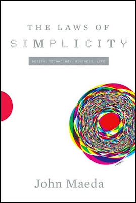
Maeda, John. The Laws of Simplicity : Design, Technology, Business, Life. New York: MIT P, 2006.
Thursday, December 18, 2008
SlideVert: A new Marketing Tool for today's Interactive Audience
Slides + Advertisement = SlideVert
Recently I visited SlideShare and viewed a beautiful 100 slide Keynote PPT Presentation called Thinking of the Future by an IBM Executive named Chirs Sparshott. The presentation was educational, interesting and a very clever use of social marketing. The last few slides subtly promoted IBM's services as the answer to the new technological changes confronting everyday people. The last page had links to IBM's website. In fact, the presentation was a SlideVert. A separate presentation by a different author titled The Brand Gap has been viewed over 400,000 times on SlideShare!
What if we upload a meaningful PPT presentation to SlideShare or on your blog that adds value for the audience with engaging visuals, hard facts and a concrete educational message. But during the conclusion or end credits you provide links to your company's offerings and related resources. Oh yeah, why not include your email address and office number too so readers can contact you with questions or suggestions.
Use your creativity, leverage your education and engineer a message that fits today's Social Media web 2.0 webscape. It is time all business people from the CEO to the marketer invest as much time targeting the ears and eyes of people, and begin to listen to their voices. A Slidevert can be the beginning of that hyperlinked conversation.
References
The Cluetrain Manifesto
Doc Searls
Sunday, November 30, 2008
Powerpoint Comedy
This guy sums many of the important point's we are taught in class and he does it in a really funny way.
Youtube video clip (5 min)
http://www.youtube.com/watch?v=cagxPlVqrtM
- Tore
Thursday, November 27, 2008
Refreshing alternative to PowerPoint
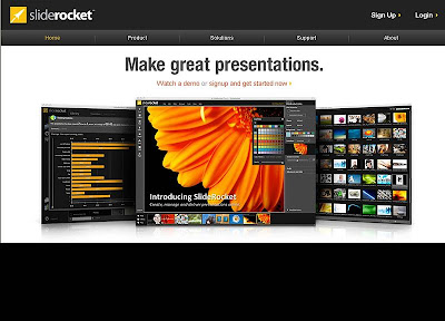 ...if only it were Free! SlideRocket is a powerful new tool to edit, share and author digital presentations. The software includes smooth special effects that if used correctly can add to the storyline, not distract from the message. Since SlideRocket is an online application, the software makers claim to provide greater options to collaborate, link data and securely share presentations online. The software even differentiates its users into five clear needs:
 - Sales
- Design
- Education
- Marketing
- Events
Unless you subscribe for this 'software as a service' model for $10 a month as an individual or $20 for an unlimited account business version, then you cannot download the special presentation player required to playback the presentation. A major downside.
SlideRocket's Comparison to Slideshare
Most people will not pay money for a software, which they feel PowerPoint can do an adequate job. First I would like to remind you that nearly all of us or our employer's have paid for PowerPoint too, only the payment was a one time charge for Microsoft Office. Unlike year or more product releases of PowerPoint, SlideRocket is continuously upgraded and made available. A key feature is that SlideRocket presentations are always accessible on the Internet, so if you can touch the cloud, you can grab the presentation regardless of location. We are all tired of trying to email 10MB PPT slide decks. For those willing to invest in the latest technology that has a chance of differentiating you from your peers, competitors and the ordinary, then SlideRocket may be the answer. Right now, I am still considering my options. But this application has me excited about the future of PC presentations.
References
Sliderocket
Tuesday, November 25, 2008
Nov. Featured Book
 Author: Stephen Few
 Before this book, few people knew to differentiate Dashboard Design according to the role the information will be used for—Strategic, Analytical or Operational.
Another key takeaway is to avoid fragmenting data sets that share relationships. Stephen argues grouping interrelated together on a single screen can tell a more complete story. Mr. Few says of Information Dashboards, "simultaneity of vision that it offers: the ability to see everything that you need at once. This enables comparisons that lead to insights."
Sunday, November 23, 2008
Notes from the book The Articulate Executive In Action
Here are some notes I made from the book The Articulate Executive In Action by Granville N. Toogood. It is just a fraction of what the book talks about but it can help you when you are making a presentation.
CVA = Communications Value Added
What is it?
- That something extra you can give
- You are not afraid to show yourself
- Passionate. You are a true believer.
Example of a true believer:
“A man named David Orrick enthusiastically pitches his industrial strength cleaners on the radio and cleans up big time”
Who has CVA?
- Jezus
- Mohammed
- Gandhi
You know these people because of what they did, not because of their written words!
The Seven principles of CVA
1. Never bore
Be passionate, use anecdotes
2. Always leave people with more when they walk out than when they walked in
Give Value
3. Always be master of your presentation, not the other way
PPT should help your pitch, not be your pitch
4. Speak only about what you know
Stick to the roots
5. Always be sensitive to the needs of your audience
6. Speak in pictures
No abstract things. Give war stories or solid but simple evidence
7. Preparation
Know what you want to tell. Do your homework
-Bastiaan
An Introduction to Sliderocket - Innovative online Presentation Application
PowerPoint also costs money in the Microsoft Office suite, but most PC users are already using PowerPoint. Understandably users will be hesitant to spend money for the added features of SlideRocket. But if you have the ability to test out the 30 day trial use of the Player, or want to invest in a powerful PowerPoint alternative software that can differentiate your presentations from others, than I recommend SlideRocket.
Personally I am still on the fence whether to make that investment. To see an interesting and educational tutorial about how SlideRocket can help you share your story, please click below.
SlideRocket Product Demos
Sliderocket Reviews on CNET.com
Effective Use of Story - John Doerr
Effective use of Story - James Nachtwey Presentation
Tuesday, November 18, 2008

Cory's Presentation Tool Box Two
Cory\ S Presentation Tools Two Power Formula And Trust Oct 24 2008
From: presentationinnovation, 1 minute ago
Pictorial of Toogood's POWER Formula for effective Presentation Delivery.
SlideShare Link

Cory's Presentation Tool Box
Cory Presentation Toolbox Guanghua Mba Course 10.10.08
From: presentationinnovation, 23 hours ago
Useful online tools to gain inspiration, function, and publish value adding presentations.
SlideShare Link

Sunday, November 16, 2008
Hans Rosling on TED
http://www.ted.com/index.php/talks/hans_rosling_reveals_new_insights_on_poverty.html
Zara Kwan
Wednesday, November 12, 2008
Rich Comedy on TED
http://www.ted.com/index.php/talks/ze_frank_s_nerdcore_comedy.html
Or search for Ze Frank on TED.
Enjoy!
-Mo Zhou
Tuesday, November 4, 2008
Beijing Zhongguancun Toastmasters Club
 A great method to get practical experience speaking in front of groups is to join a local Toastmasters club. Founded over 80 years ago in California, today Toastmasters International serves nearly 250K public speakers globally in over 90 countries.
 For students at Peking University I recommend attending the Zhongguancun Toastmasters Club located in the 4th Classroom, 20th Floor, Tower B, Tsinghua Science Tower, Tsinghua Science Park, Wu Dao Kou, Haidian District, Beijing, 100084, China or please look for other Toastmasters locations in Beijing.
Meeting Time: 7:00 p.m., Tuesday
The Club is open to all. For details you may call 13810317670 , email cindyaidover@hotmail.com.
References
Thursday, October 30, 2008
David S. Rose: 10 things to Know before you Pitch a VC for Money
Ted Bio - David S. Rose "The Pitch Coach" is an expert on the business pitch. As an entrepreneur, he has raised millions for his own companies. As an investor, he has funded millions more.
Wednesday, October 29, 2008
Oct - Featured Book

Full Title: Presentation Zen: Simple Ideas on Presentation Design and Delivery
By: Garr Reynolds
Published: Jan 2008
Garr Reynolds is a former Manager of WW User Group Relations at Apple Computer, and is a currently a Marketing and Multimedia Presentation Design at Kansai Gaidai University in Japan.
In this "How-to" book, Presentation Zen, Garr offers a fresh teaching approach to presentation design. Garr organizes his book into three sections Preparation, Design and Delivery. Within these sections Garr stresses Clarity, Simplicity and Naturalness.
He cautions not to begin writing your presentation in PowerPoint, and instead to get out a notepad or scratch paper and jump into the creative process feet first. Imagine Shakespeare writing Romeo & Juliet in PowerPoint slides, it would have proved creatively impossible. Before digitizing your presentation, write it down on paper, yellow post-its, or a whiteboard. Generate a lot of ideas and then cut away the unnecessary information, then prioritize and organize your main points.
Garr also stresses not to "Data Dump" or simply paste entire excel sheets full of figures into a PowerPoint slide. Instead Garr asks readers to crunch the numbers first, consider the implications and wider relations and sum up the conclusion on each slide. He points out that the slide is not the place for you to walk the audience through a detailed walk through a process, that is better left to an actual printed document with deep explanation. Rather every slide should state a conclusion, a key takeway that the presenter can expand upon during the presentation.
This is a new and valuable approach to presentation design in a digital and information rich society.
External Review
"Please don't buy this book! Once people start making better presentations, mine won’t look so good. (But if you truly want to learn what works and how to do it right, Garr is the man to learn from.)"
Seth Godin, Speaker and Blogger & Author, Purple Cow
References
Garr Reynolds speaks @ Google March 2008 Video
Garr Reynolds Presentation Tips
PPT Review of Presentation Zen
Presentation Zen @ Amazon.com

